


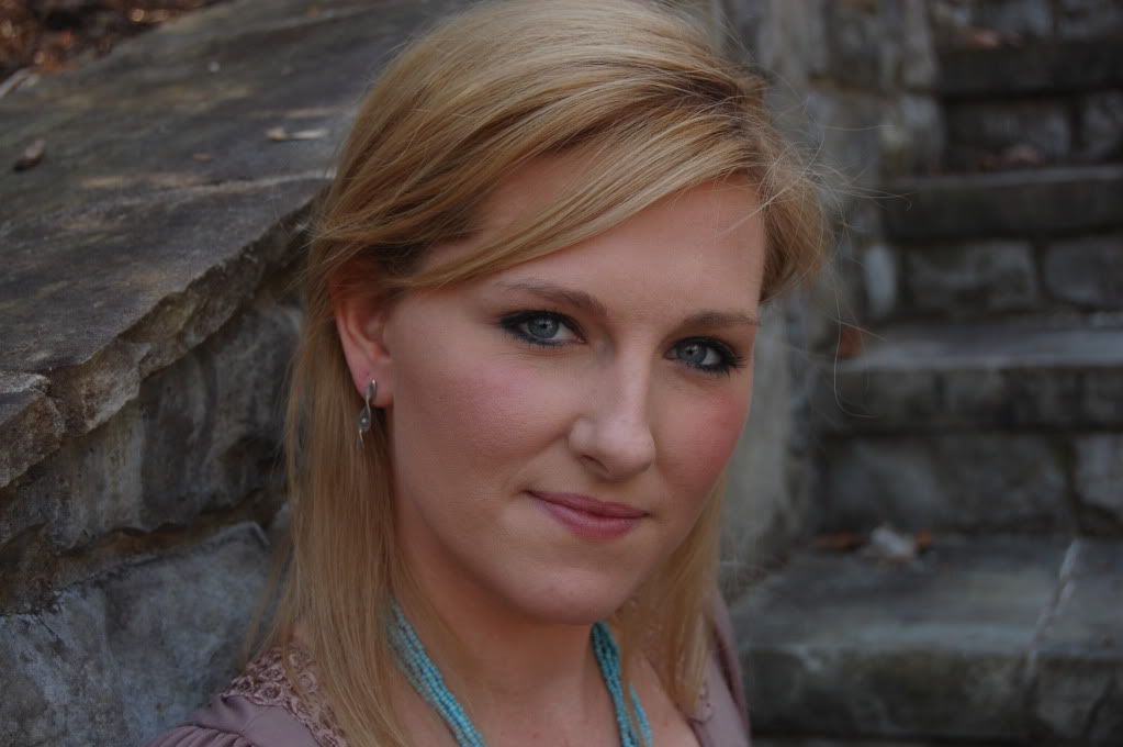
My friend, Betty John, is the one who enlightened me about the Levels Adjustment Layer on PSE 7. My photos are usually underexposed, a problem that was recently solved. But it still helps to go to the Levels Adjustment. Let me show you:
 |
| SOOC |
It doesn't look too bad, exposure wise, to me. But let's check:
 See that white triangle to the right of the input levels? If I drag it to the left to the first peak , it will make a difference in how the photo looks. Watch:
And here is the picture after the adjustment:

Much better, don't you think? Next flatten your layers.
Now look what happens when you go to make a hue/saturation levels change:
 |
See how the background changes to more of a blue? I don't like it in this case, but don't be afraid to experiment. Okay, now I am ready to continue with my edit. Of course, flatten at this point. I don't like how the background is not all the way to the right, but we are going to fix that with the Marquis tool.This is a trick that I learned from Shauna at Flora Bella:  |
Now, you are going to grab the transform tool, shortcut is "Ctrl t". And then place your cursor on the right part of the line and drag it to the right, to fill in the purple background.
Like this:

See how that works!

Now, that's better:

I like to do a "Screen" with opacity of about 50-55% like this:
 |
| See how the whole picture is lightened and has a softer look? |
Next, I am going to run an action by Flora Bella, called Sweetness:

At this time, I like to add a texture so I am going to head over to my files by Kim Klassen to see what I like today:
This is a Kim Klassen texture called "Life is good" and I applied it with the free MCP action {http://www.mcpactions.com/} that automatically adds the texture and gives you multiple ways of adjusting it. I chose Overlay and Color Burn, then selected each layer, I used a soft black brush with a lower opacity of about 75% and brushed away the texture from the flowers and vase.


This is my final result. What do you think? :o)


3 comments:
Love it! I especially appreciate the tip about the marquis tool, where you dragged the background over to make it more consistent. I will have to try that in PS3. Hope it does the same thing.
Thank you for taking the time to share these little tricks. You made it super easy to follow along.
What I love are all the colors in the image, and I especially love the final result. Very nice tutorial, Charlotte!
thanks for the encouragement!
Post a Comment